Websites that Work
Our work speaks for itself
We keep your specific goals in mind and create websites that work – for you, for your visitors, and for the search engines to achieve the best rankings.
Local Business Websites

Downtown Issaquah Association had a static website that just wasn’t conveying the fun that their ongoing events offer; and, there was no easy way to update their event calendar or website overall.
We created their branding and logo: Historically Hip, to include their focus on the history of this century old town along with their love of the arts. We then converted the content from their existing static page to a WordPress based site for easy updating. Additionally we branded their social media and incorporated it into the design for community building.
You can see the result on the left, and if you want to see the ‘before’ click here.
We had created other websites for Michele Rosenthal – so when it was time for a makeover on her family’s company website, Rosenthal Capital, they contacted us. Their current static site was outdated, and hosted with a company that would be closing down services.
There were some very special needs for this website including member only access to internal pages to comply with the Securities and Exchange Commission regulations for hedge funds; while the blog redirects to a public blog page outside the main website.
Here’s what RCM had to say at the completion of their new website:
“What I love about working with Susan and her team – and the reason this is the third website on which we’ve collaborated – is that I can always expect a high level of expert input and guidance, efficient and timely delivery, and terrific customer support throughout the process. For our most recent site Online Promotion Success delivered a membership-based website that is beautiful, clean and fresh in concept, plus wholly meets the SEC compliance guidelines so important for a financial site. Whether I seek a simple template or have complex needs Online Promotion Success delivers exactly what I imagine and desire for my online brand.” ~ Michele Rosenthal, Rosenthal Capital Management, CCO
The result can be viewed above, and if you want to see the original site, click here.
Rooney IT needed their red and black logo incorporated into a new website look that better conveyed their company message than their prior blue static website provided. The current site was also very busy with so much information, their visitors were overwhelmed and failed to take action.
We worked with the owner to find stock images and created call to action language and a direct call to action option to attract the right prospects and convert them into leads. The clean lines and simplicity of message provides a better platform.
The result can be viewed to the left, and if you want to see the original site, click here.
 Meadows Livingstone School, a private school located in San Francisco and focused on helping children of color with both academics and arts, needed a presence online that matched their goals.
We worked with Gail Meadows, the school director, to determine the right look and description to attract the families and students who would appreciate what they offered.
Aimee Bahr, a local massage therapist was on a budget. We created a basic website that was easily viewed on smartphones; and, provided a click-to-call option to increase action, while still providing a presence on a traditional computer.
Additional marketing collaterals:
- We created business cards to reflect her branding.
- We created a QR Code optin offer with display tents in her office to facilitate having the ability to send special offers and coupons.
IssaquahMassageTherapist.com – Set up for easy click to call and reading on Mobile
Author and Publisher Websites
We created a custom WordPress theme with a scrolling header bar to display their client’s books, and created a script for her welcoming video. We also wrote the copy for the website creating a clear message of both what her company provided and how they preferred to be contacted.
Here’s what Penny had to say after her new website went live:
Terry Tegnazian, President of publishing house Aquila Polonica (U.S.) Ltd. needed a website for their new publishing company and release of their first book, The Mermaid and the Messerschmitt; along with the ability to grow and maintain the website for many more planned book releases.
Their Director, Stefan Mucha, desired the Joomla platform and we created an easily editable custom designed website using that content management system.
In addition to creating a custom theme that represented the branding of both their publishing company and their niche, we created multiple menu systems which direct visitors to both individual books but also individual content items per book.
Polandww2.com
Robert Yeager, a well known writer with a career that included articles written for major publications like the NYTimes, needed a website that focused on a new historical fiction book, due for release – while providing a way to showcase his long term writing career.
When he first contacted us a website had been started for him by a developer who could no longer continue the work. We believed we could provide a better direction for him, the completed website is to the left. If you would like to see what he would have been using, take a look here.
“Susan proved especially helpful with someone (me) establishing a first-ever web presence. Not only is she a top designer—I’ve been flooded with compliments on my “handsome” site—but she is also a patient explainer. Susan makes being an Internet partner not just a catchy phrase, but a precise description of who she is and what she does.” Robert C. Yeager, writer, author, The Romanov Stone
RobertCYeager.com
Bob Livingstone, an author of multiple books, had a website that was difficult to navigate and didn’t give him the ability to showcase a particular book he was promoting.
We created a website with clean lines and easy navigation that provided the high level exposure for his book(s) that he desired. Here’s what Bob had to say:
“In a time where customer service can be a roll of the dice, Susan Gilbert is a diamond in the rough. She has all the qualities you would wish for in a web designer. She is highly professional and informative. She lets you know what her plans are for your site each step of the way and her fees are very reasonable. She did an awesome job on my website www.boblivingstone.com. She is knowledgeable about what authors need on their site and shares her wisdom and experience with you. She returns messages promptly and clearly. I highly recommend Susan Gilbert and I plan to utilize her services again in the future.”
 We first started working with Michele Rosenthal on an entirely different website, HealMyPTSD.com, make edit and design changes. During the process and with Michele’s first book due to release, she wanted to know what she could do to market her book with this website when the visitors were not proactive learners.
Michele purchased a coaching package with our founder, Susan Gilbert, where she assisted Michele in determining her target market or ‘avatar’ to attract the perfect customer. What she discovered was that she wanted to work with and her book would appeal to a entirely different market than PTSD. A new website was born, Change You Choose.
Watch Michele’s Video Testimonial of that process here: Michele’s Author Testimonial
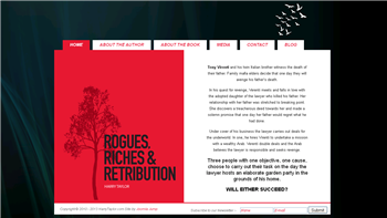
Harry Taylor’s first murder mystery, Rogues, Riches and Retribution needed a website to match.
We used elements of the book cover and designed a custom website to elicit the sinister feeling of this mafia thriller that spans two continents.
The site was created in 2010 and the client has contracted with us to maintain all his WordPress and plugin updates.
The book has been revised and with a new release date and second book to follow, OnlinePRSuccess will also be providing book marketing and media services for Harry.
David Mercier‘s book, A Beautiful Medicine, is both beautiful in message and design. When he first contacted us it was for SEO on a landing page. We discussed his goals and in doing so, David realized that he needed a website that would support his beautiful book, message and ongoing work.
Keeping in mind that he additionally needed exposure for his coaching programs we created a unique rotator on the homepage and design elements from his book.
Congratulations to David whose book was recently named the Grand Prize Winner of the 2013 Nautilus Book Awards.
DavidGMercier.com
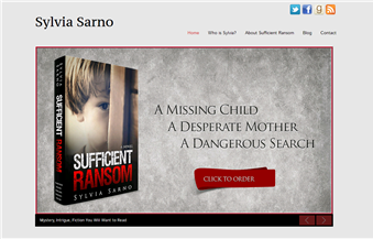
 Sylvia Sarno is a new author whose first book Sufficient Ransom is being pitched to publishers with a second book nearly completion. She understands that beginning her marketing now is important for both acquiring a publisher and selling books.
We created a responsive website that can be easily viewed on all mobile devices and notepads. We also assisted her with a designer for her book cover. The completed site reflects the book’s genre and provides a platform for Sylvia to begin reviewing books and gaining readers to her blog.
Sylvia says:
“Thank you for all the team members who assisted in creating my site. I look it looks great and is very functional! Your knowledge and advice really helped me get a great product and took away much of the stress in getting the site up. Thanks for being so patient with me!”
SylviaSarno.com
Additional Website Examples of our work can be viewed in the Gallery


